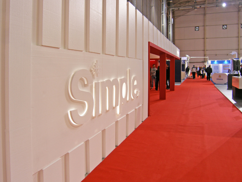
“Synergy” logistics company’s new promotion motto was “SIMPLE”, in terms of simplifying everything for the client through its services. Thus, ‘Simple’ became the guiding inspiration for the design of the exhibition stand. In order to project the company’s new image, simple lines, forms and colours were employed. In addition, in an attempt to subtly evoke this image through structure, the external shell of the kiosk is inspired by a metal container: a metal container that has had its sides sliced off to draw visitors’ attention to its internal space. In its turn, this space includes three information points, two meeting rooms and a refreshments bar. As regards the colour scheme, the company colours, namely white, red and black, were used for the overall design. A distinguishing element of the white parts was their manipulation with cnc machinery. Specifically, EPS (expanded polystyrene) with densities ranging from 15Kgr/m3 – 30Kgr/m3, were cut into 5cm-thick boards using cnc machinery. Additionally, the boards were coated with a special varnish in order to achieve a high quality finish. The same cnc method was applied to engrave the company name and motto on the external side boards. This element works in a dynamic combination with hidden fluorescent lamps, to create the kiosk’s signage. Moving to the internal part of the kiosk, whiteboards have been utilized as exposition surfaces for graphic design promotional applications.